As a social media junkie, I am constantly reading articles, lists, advice, and news on the subject. I want our visual design team to place Twitter, Facebook and Youtube buttons at the top header of our website – and I want our clients to do the same. I want links in every email blast, printed on business cards, and on signage in brick-and-mortar retailers. I comment on blogs, I write blogs, I advocate and create videos – I love social media.
But how much is too much? At what point do we overwhelm our websites with links to, lets be honest, 3rd party sites? Are we driving users away from the very place we purport to use social media to drive them to?
In previous articles we have shown you how to add Facebook Like and Share buttons to your site and how to embed a Tweet button on your site – you can even see our Twitter feed on the right of this blog and retweet or share on Facebook this article from links below (we hope you do)! We are obviously big fans of engagement through social media, and while perhaps we need to take it a step further on our own site (stay tuned for our forthcoming redesign), I think some people might be taking it too far.
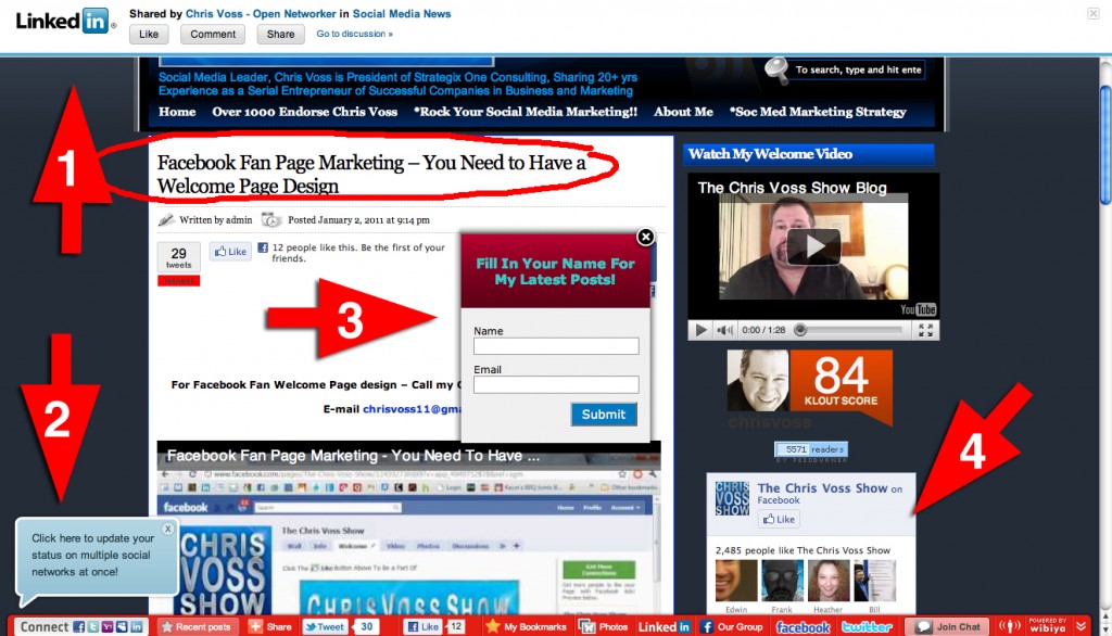
Today while browsing the Social Media News Group on LinkedIn which I recently joined, I saw a link shared by the groups leader Chris Voss to an article he had written entitled “Facebook Fan Page Marketing – You Need to Have a Welcome Page Design“. I clicked it and was taken to his website, and the inspiration for this article. Up until this very moment in writing this article, I had not read what I thought to be his blog entry (turns out its a video). I was so visually overwhelmed by calls to action on his site that I left – not to be bothered with digging through it all to find the content in question. Behold:
Now, looking at it here does not give the same effect as this image is static and I’ve drawn red arrows over everything. So just imagine that all of the things the arrows point at are popping up or sliding around.
- As this link was shared on a LinkedIn Group, there is an iFrame header that pops up first, over top of whatever (and wherever) the link takes you.
- A pop-up appears over the Drawer that slid up (double whammy) enabling me to “update my status on multiple social networks at once!” Yay.
- Another window pops up asking me to subscribe immediately to the blog/website… which I haven’t even seen yet… No thanks.
- Something popped up and then disappeared over here that I completely missed by the time I had the wherewithal to take a screen shot.
From what I understand, Chris Voss “is President of Strategix One Consulting, Sharing 20+ yrs Experience as a Serial Entrepreneur of Successful Companies in Business and Marketing”. He has a “show” (video blog) where he shares his advice and knowledge with everyone, and comes across as a nice guy. I watched his welcome video. So lets look at the content on his page.
iframes and Pop-Up Windows
Since I came here via LinkedIn, if I try to navigate through Chris’ website on my own, I am stuck with that iFrame at the top (Arrow #1) which will be a pain if I want to bookmark or link to anything directly. Its easy enough to close by clicking the “X” in the top right hand corner – which I always do on iFrames, as I find them annoying. While I’m at it, I close any pop-up window that hasn’t disappeared on its own, and I begin to feel more comfortable on the site already. I still have the Drawer at the bottom but I can handle that for now – though it is the busiest Drawer I have ever seen in my life.
Self-Promotion
I get it. You’re a marketer. But the first thing I see (once I actually get to the article) is you asking me to hire you to design my Facebook page? I have NO problem AT ALL with a call to action like this, but put it below the content. Show me why I would want to hire you first. Show you me you know what you are talking about before hitting me with a pitch. This is like the pop-up asking me to subscribe the first second, the first time I visit your page (Arrow #3). Don’t make me scroll down to see the content I came to your site to see.
The article is actually a video blog entry, which is fine, but the first 30 seconds are – you guessed it – a pitch to subscribe and watch more content. The next 7 minutes or so basically tell the viewer that you should have a Welcome page on your Facebook Fan Page by showing other brands that have them. Do I think you should have a Facebook Welcome page? Yes. You can do a lot with them. They are really great for promotions. Do I think you should watch this video? No. Not really informative – unless you have no idea what a Welcome Page is and then yes, give it a watch! Otherwise its basically a fluffy ad.
Besides the pop-ups, the most prominent thing you see on the site is the number “84″ in white, which is Chris’ Klout score. Klout is a firm that attempts to measure social influence, and while 84 is a good score (better than mine), does it really need to be so prominent on every page? Well, I guess if you’re selling yourself as a social media expert, its a good thing to share as it IS relevant. But still.
Also, the second link in navigation – after “Home” – is a list of tweets saying nice things about Chris Voss, labeled as “endorsements“. And while being messaged/mentioned over 1000 times is pretty awesome, I have to say… really? A copied and pasted list? At least embed a saved search from twitter with your name as the query – you’re Mister Engagement!
Advertisements
There are a number of ads on the page and while I understand the need for monetization, many seem to be ads for business practices that are shady in the social media world – like automated twitter “managers” and “get famous on youtube” banners. There is no unified size to ads and they seem to be slapped down the side of the page…
But Does It Work?
Despite my personal opinion on many of the elements to Chris Voss’s site (and please note, I am not commenting on his knowledge, products, services or abilities in ANY WAY – only my impression of the physical site), it seems to be working for him. I posted a comment for him on LinkedIn and hope he sends me some of his stats and analytics on how his site is performing so that I can share them here, but he currently has over 68,000 followers on Twitter, over 2,400 fans on his Facebook page, and over 900 subscribers to his YouTube Channel.
I would love to hear/read your thoughts and comments on this and similar sites. And for all of Chris’ many fans out there, my opinions are my own and not Captico, LLC’s. But I would love to know what drew you to Chris Voss, what you like about his site and methods, and what you would improve if you could.
As always, thanks for reading!
Related Articles:
- How Do I: Connect My Twitter and Facebook Accounts?
- Facebook’s New Spam Filter for Pages
- How Do I: Post Updates on New Twitter?
- Side by Side Comparison of Old and New Twitter Interfaces
- Modules, widgets, boxes oh my! What do you call a box?
Tags: buttons, chris voss, connectivity, Corrie Davidson, drawer, facebook, linkedin, modules, navigation, right hand rail, Social Media, social networking, twitter, widgets, youtube


I totally agree with you.
nice post very interesting