
Well, maybe not fun, but less annoying for sure!
You’ve probably encountered a 404 or “Page Not Found” error in your web browsing experience. It is an HTTP standard response code indicating that “the client was able to communicate with the server, but the server could not find what was requested. 404 errors should not be confused with “server not found” or similar errors, in which a connection to the destination server could not be made at all. A 404 error indicates that the requested resource may be available again in the future.” This kind of error is commonly displayed after you click a broken link or follow a link to a page that has moved or no longer exists on a website. (If you want more technical details, check out Wikipedia.)
Of course no one wants their website to have errors, but sometimes they occur. There is definitely value in taking a little time to dress up your “Error” or “404″ page to decrease the frustration when a user encounters it. So what can you do to make the navigation process on your website less of a headache to users?
1. Brand your error page.
I am always amazed that companies don’t brand their error pages. Technically that page is still a part of your site and therefore a part of your interaction with a potential client. Don’t launch an interested user off into the interwebs – use your logo, colors, brand language, visual elements, even the whole design theme. Show them they are still connected to you.
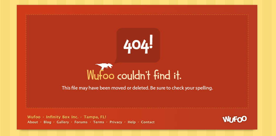
The image below is a 404 Error Page from Wufoo, an online form builder site. You can see it is well branded, keeping with their site design. It even has the main navigation links to their site at the bottom to encourage users to keep looking through the site.
2. Give Users a Place to Go
At the minimum, provide a link back to your homepage. Include contact information or links to similar material or popular articles. Have a search box for them to manually locate the desired material. Don’t force users to click the “Back” button which may take them back offsite – you have them on your site so keep them there by offering them another entrance to your environment.
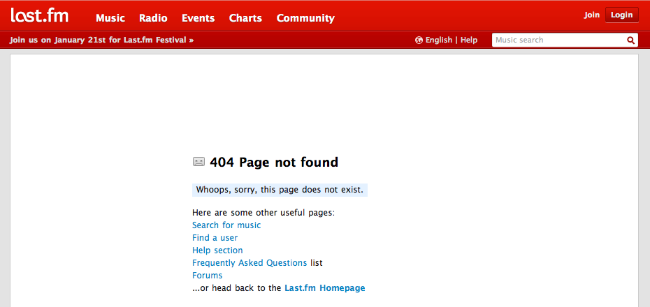
Below, internet radio site last.fm has an error page with their sites navigation on top and potential content links below.
3. Be informative
Tell users what the problem is (or might be). Chances are, your visitors are not as well-versed in programming languages as your developers are so be clear and keep it simple. Share ideas on what could have cause the problem, and what they can do to fix it – and provide a way for them to let you know its broken!
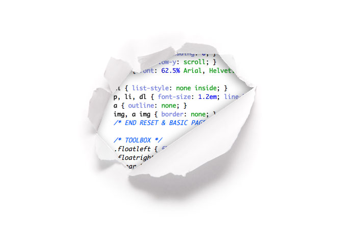
The image below is an error page from web design community CSS Tricks, and while I love the idea, its not very useful nor informative.
4. Be funny – or at least entertaining!
Have a sense of humor with your error page. Write a haiku, include clever commentary, post a funny picture or cartoon! You can be informative and witty at the same time. I would caution against making a user feel stupid however. It may be funny, but if a site tells me “Way to go, moron”, I’m more likely to click away then try again. Check out these entertaining 404 Pages.
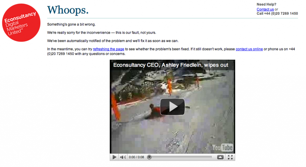
The image below is an error page from Econsultancy a Digital Community of Marketers. You can see they have their logo, contact information, suggestions to fix the issue, and a funny video of their CEO wiping out in the snow.
Do you have any advice for better 404 pages? Any tales from your web surfing adventures? We’d love to hear it! Leave a comment!
Tags: 404, branding, Corrie Davidson, customer, design, error page, service, user experience


wicked blog, this is going out to my twitter feed. thanks.